Design & Development
UX design in Qatar
Mapping how your customers actually decide, before anything gets drawn.
Task: get a quote
- 1Open the menu
- 2Tap Services
- 3Tap Facades
- 4Scroll past the gallery
- 5Find “Contact us” in the footer
- 6Fill in a 9-field form
6 steps to a quote
7
projects shipped across Qatar and the GCC





Design, search visibility and pipeline — built together, in English and Arabic.
Definition
What UX design is, and what it is not
UX design (user experience design) is deciding what a visitor sees first, what they do next and what stands in their way, before any colour or typeface is chosen. On a business site it is three pieces of work: a journey map for each kind of buyer, the information architecture (which pages exist and what they are called), and wireframes for every page template.
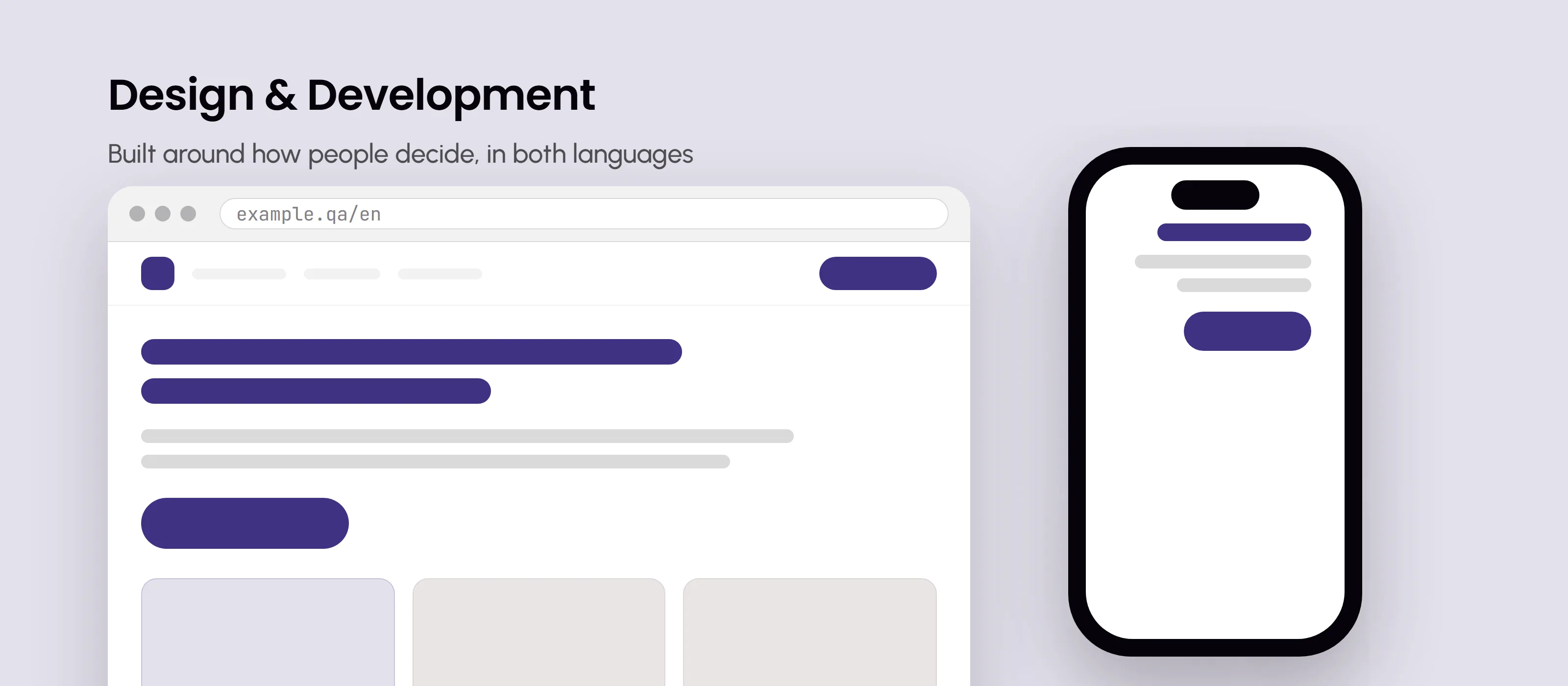
It is not the look of the site, which is UI design, and it differs from conversion optimisation, which fixes the path on a site that already exists. Try the wireframe above: six steps to a quote become two.
Why it matters
Why it decides whether a site sells
A visitor arrives with one task, such as a price, proof that you have done this before or a way to reach you, and either finds the path you planned or leaves. On a phone, which is how most customers in Qatar meet a website, every extra tap is a point where some of them go, and they never appear in a report as lost sales.
Cheap early, dear later
Moving a block on a wireframe takes minutes. After launch it means changing design, code and content, in two languages.
A new look rarely fixes it
A redesign that only changes the surface tends to leave the enquiries where they were.
Arabic buyers take another path
Arabic visitors often search for something different and land on different pages, so their journey is mapped on its own.
One decision can carry a site
Bushra Pharmacy was built without a cart, around WhatsApp and delivery apps, and brought 475 patient enquiries in 60 days.
What it produces
Four things UX work produces, and how to judge each
If a supplier's UX phase ends in a mood board, it was not UX. These are the outputs that matter.
A journey map per buyer
What each kind of customer searched, where they land, what they doubt and what they do. Test: you recognise your customers, and every step names a page.
A sitemap
Every page, its name and its place in the menu. Test: labels use customers' words, like Villa facades, not Solutions, and nothing important is over two taps deep.
Wireframes
Each template in grey boxes, in the order a visitor needs things. Test: on a phone, the main action and one proof point sit on the first screen.
One main action per page
A quote, a call or a booking. Test: you can say it in three words, and it works on WhatsApp as well as in a form.
Test it yourself
How to test a journey before anything is built
No lab needed: a task, a phone and five people from outside your team.
Write three tasks
In your customers' words, such as find out roughly what a villa facade costs. Each ends in an enquiry, a call or a booking.
Find five people
People like your buyers, at least one using Arabic. Five usually shows the problems that matter, because most of them repeat.
Hand over the phone and stay quiet
Your current site or clickable wireframes. Read one task, then don't point and don't explain the menu.
Write down three things
The taps taken, where they hesitated or went back, and whether they finished.
Fix the worst step, then repeat
Fix the step most people stumbled on and run the same tasks again. In the demo above, six steps to a quote became two.
A worked example
An example: a stone-cladding contractor's home page
An example business, the one in the demo above, not a client: a Doha contractor that clads villas in stone.
Before
- Slideshow and company story firstThe first screen answers none of the three questions buyers ask on WhatsApp every week: price per metre, timing, finished villas.
- Contact hidden in the footerA quote takes six steps through the menu and past the gallery, ending in a nine-field form.
- Arabic copied from the English menuThe Arabic pages mirror the English ones, though Arabic buyers in this example search for the stone, not for a contractor.
After
- Get a quote on the first screenA button with WhatsApp, then recent projects with reviews, then services. Two steps to a quote, or a three-field form.
- Pages named by what buyers askVilla facades, Commercial cladding, Stone types, Projects. Each project names the area, the stone and how long it took.
- An Arabic entry page of its ownA guide comparing stone types answers «حجر سوري للواجهات», the search Arabic buyers in this example actually make.
What UX design includes with us
A journey map for each main type of buyer, from first search to enquiry
A sitemap and menu named in the words your customers search with
Wireframes for every page template, agreed before visual design starts
One main action per page, on the first screen of a phone
Each main task walked through on the wireframes, on a phone, before the build
Arabic journeys planned as their own path, not a mirror of the English
A conversion-path review of your existing site, if you have one
Common questions
Is UX design separate from the website build?
No. It is the first phase of the build, not a separate study. The journey maps become the sitemap, the sitemap becomes the wireframes, and the wireframes become the pages we build. That matters, because these decisions only pay off if the people building the site follow them. A research deck handed to another team is usually read once and lost.
What does UX design cost?
It is part of the website project, not a separate fee. Websites start from QAR 8,000 as a one-off project with Arabic and English included, or from QAR 15,000 with enquiry tracking and a sales pipeline. The price moves with the number of page types and integrations. If you only want an existing site's journey fixed, that review is quoted after a first look.
Do you do user research?
As much as the project justifies. For most small and mid-sized business sites that means reading the evidence you already have rather than commissioning a study: how people search for what you sell in each language, what similar businesses show, your enquiry history, and the questions your team answers every day on WhatsApp. Each of those questions is something a visitor wanted to know and could not find.
What do you need from us?
Three things, and none of them is an opinion about design. A few weeks of real enquiries, such as WhatsApp chats or call notes, with personal details removed. Your most important services or products, ranked by value rather than volume. And an hour or two with the person who answers customers, because they know which questions come up before people buy.
How long does the UX phase take?
It runs inside the first weeks of the build rather than adding to it. Most websites take four to eight weeks from kickoff to launch, and the structure is agreed before visual design starts, so nothing is styled twice. The pace depends mostly on decisions: a wireframe review with the person who signs off can take a day or a week. Both languages are planned in the same pass.
How will we know the new structure works?
By counting what visitors do. Watch the share of visitors who get in touch, the steps between landing and enquiry, how many start a form and how many finish it, and how many phone visitors tap WhatsApp or call. A broken path shows a difference within days of the fix; a new structure needs a few weeks of enquiries. Tracking waits for consent, so start it before launch.
More in Design & Development
Every part of Design & Development works better alongside the others — here's the rest of it.
Ready for a site that earns its keep?
15 minutes · A clear next step · No pressure